ROLE: UX/UI DESIGNER
DATE: 2023
Buzzr is a social health and habit goal tracker that fosters motivation and accountability by connecting users with friends and loved ones. With its user-friendly platform, Buzzr empowers individuals to track their progress, share achievements, and receive supportive reminders, making health improvement a collective and enjoyable journey.


BACKGROUND
In recent years, the popularity of health tracking technology and apps has soared. The COVID-19 pandemic has intensified people's interest in personal health. Individuals are more motivated than ever to monitor and improve their well-being. Recognizing the need for a health and habit tracking app that embraces social connections, Buzzr was created.
PROBLEM STATEMENT
While there are numerous personal health and habit tracking apps available, there is a gap in the market for a platform that focuses on collaborative health journeys with loved ones or friends. What about the potential users who would like to make sure their loved ones are also making strides to a healthier body and lifestyle?
RESEARCH GOAL
Driven by this observation, I conducted extensive research to gain insights into the needs and aspirations of individuals looking to improve not only their own health and well-being, but their friends' and family's as well.
-
What features will help create a supportive and encouraging space for potential users?
-
What do people value when it comes to improving their health?
-
Will users find this type of feature an invasion of privacy?
-
What will keep potential users interested in logging their health data?
-
Is this too niche of an issue?
User Research
01
COMPETITIVE ANALYSIS
02
USER INTERVIEWS
03
AFFINITY MAPPING
In order to design the best product, I started with a competitive analysis to look at what current leaders of the health and habit tracking industry are offering and how they're succeeding.
HealthView, MyFitnessPal, and Daylio Journal all promote health and habit tracking and are free for users to join. However, I confirmed the hypothesis that these health and habit tracking apps did not have ways for users to collaborate with others.

UNDERSTANDING USERS' VIEWS ON HEALTH AND FITNESS
Seeing what competitors had to offer inspired me to continue looking into how we can create a supportive and encouraging space for our users. Speaking to users was incredibly insightful and helped me gain a deeper understanding of how users perceive health in general.
Main Takeaways
When it comes to the health of others, all participants expressed concern for the well-being of someone important to them. However, only one participant said that they regularly check up on their loved ones' health. Despite people's awareness of the importance of health and their concerns about the well-being of their loved ones, there seems to be a lack of tangible actions taken towards improving their health.
The data also strongly indicates that there is a positive impact on individuals' well-being and their health journey when they have a support system. However, a significant number of people lack access to a supportive network.
Moving forward, I wanted to look into how we can normalize the act of checking up on the health of others and explore ways to enhance the accessibility of support systems.
By doing so, we can empower individuals and foster a culture of care and well-being.
POV STATEMENTS
I'd like to explore ways to support individuals who are invested in their own health as well as the well-being of their loved ones to:
-
find motivation to achieve their goals
-
be part of someone else's support system
-
have a support system
HOW MIGHT WE:
-
make health conversations more approachable?
-
enable users to support their family and friends?
-
utilize health and habit trackers to make positive lifestyle changes?
-
encourage users and their loved ones to reach their goals?
-
help users stay motivated?
TARGET AUDIENCE
Based on the data gathered from user research, I created two user personas to address different user needs, motivations, and pain points. With the user personas in mind, I put together storyboards to visually convey how our target users would use Buzzr.
User Personas & Storyboards

MAPPING FLOWS
Based on the personas and storyboards, I drafted user flows that translates the users' needs and goals into different ways they can navigate through the product. From the user flows, I created three task flows that I can use for the usability tests. Mapping these flows allows me to identify what needs to be designed, built, tested, and validated.

BRANDING
Created a brand style tile to establish the visual identity and aesthetics of Buzzr. The brand values and colors capture the feelings we hope our users would experience after being a part of the Buzzr community.

WIREFRAMES
For my low-fidelity wireframes, I went with a mobile-first approach. After deciding on the designs that best fit the user's needs, I moved on to mid-fidelity wireframes:

HIGH-FIDELITY WIREFRAMES
To streamline the high-fidelity wireframing process, I created a component library with every possible component that I may need for the wireframes. Having a thorough component library allowed me to create my high-fidelity wireframes easily and make quick changes without messing up the layout and spacing.


ITERATION #1
Added icon labels
Some users had trouble figuring out what the icons were for.
Added labels to icons in the 'Create Post' screen so users can clearly see what each icon means.

Before

After

Before

After
ITERATION #2
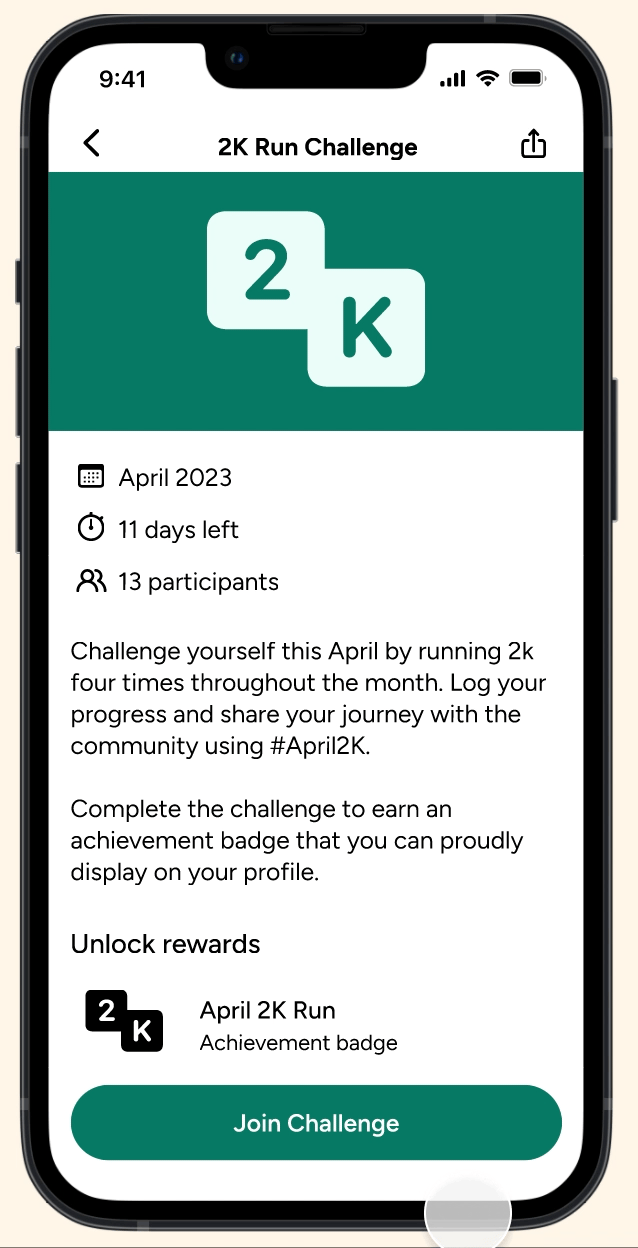
Added a 'Your Challenges' row
Users said that they would like to easily see the challenges they've joined or completed.
Added a 'Your Challenges' row to the 'Challenges' page.
ITERATION #3
Changed pop-up
to toast message
Users said they felt the pop-up message was limiting their options.
Changed pop-up message to toast message to give users more control over what they want to do next.
After
Before
Before
After
ITERATION #4
Combined reminder and notification page
Users said that it would be more intuitive to check notifications from the home page rather than from the side navigation menu.
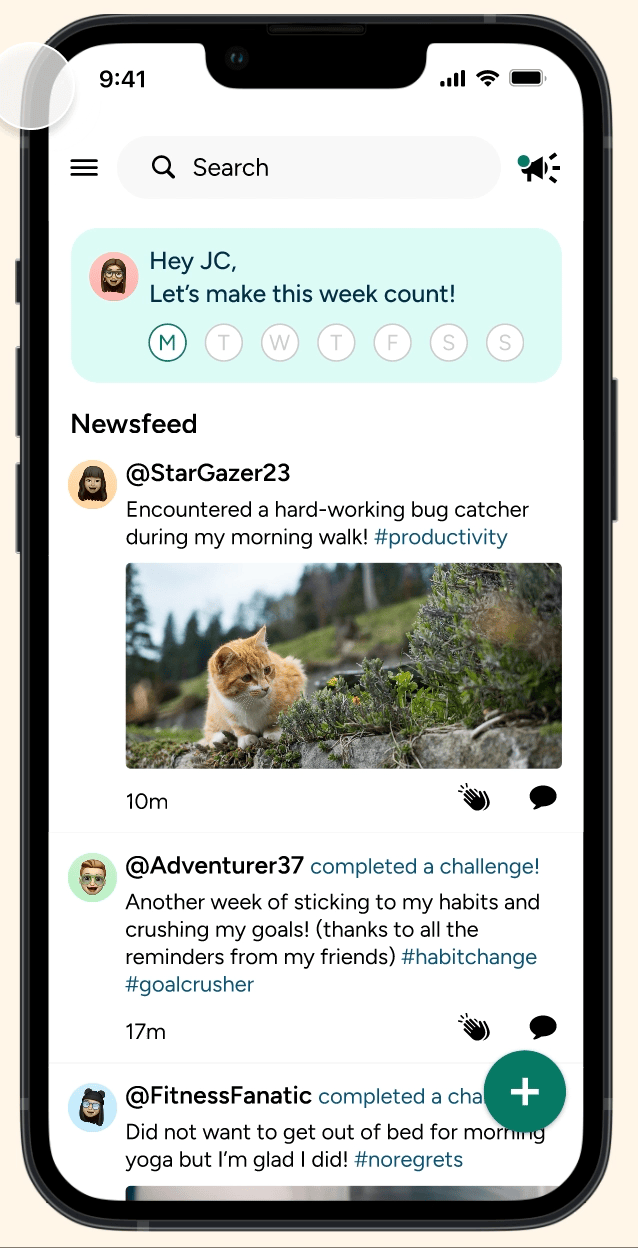
The reminder icon now leads to the notifications page instead of the send reminder page.
ITERATION #5
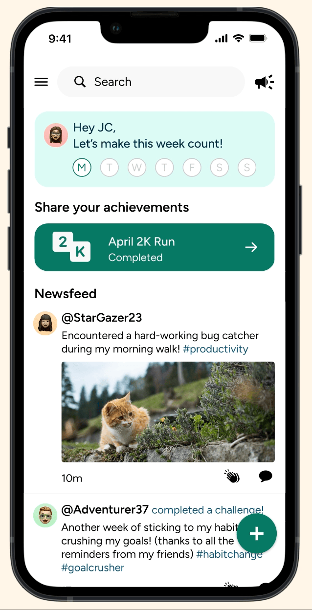
Added a 'Share your
achievements' card
Users wanted a way to share their achievements with their community.
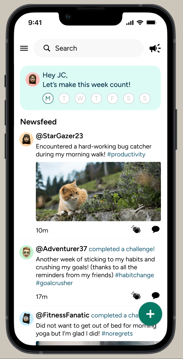
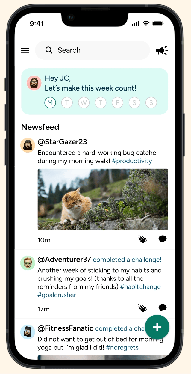
Added a 'Share your achievements' card to the home page. It shows their recent achievements and prompts users to share their progress in a post.
Usability Testing (5 participants)
TASK FLOW 1
Join a monthly challenge
-
Ease of task flow: 4.6/5
-
Completion rate: 100%
-
No critical errors
TASK FLOW 2
Send a reminder
-
Ease of task flow: 4.6/5
-
Completion rate: 100%
-
No critical errors
TASK FLOW 3
Post your achievement
-
Ease of task flow: 4.5/5
-
Completion rate: 100%
-
No critical errors
TASK FLOW 4
Celebrate a post
-
Ease of task flow: 4.5/5
-
Completion rate: 100%
-
No critical errors
NEXT STEPS
-
Limit the amount of reminders users can send daily (needs further testing)
-
Implement premium features & premium subscription
WHAT I LEARNED
-
Being well-prepared for user interviews results in more thorough answers from participants
-
A detailed component library is key for saving time and preventing headaches when designing high-fidelity wireframes
-
Always ask participants questions like "why?" and "what would make sense to you?" during usability tests